Claude

Figma

Cursor

Directa | UX Redesign

Directa | UX Redesign

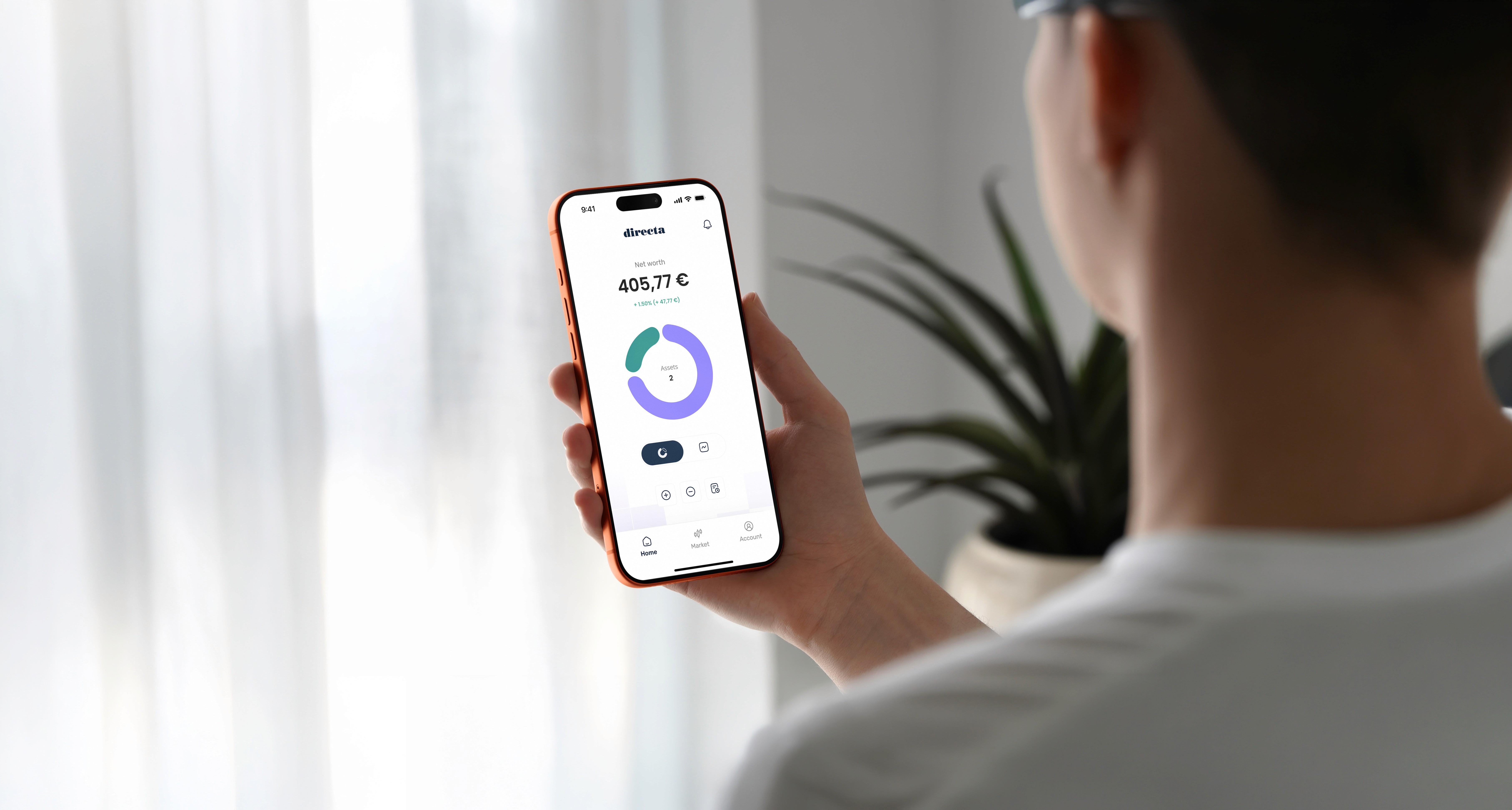
Directa SIM is one of Italy’s oldest online brokers, having been in operation since 1996. Its app works, but it's showing its age. This concept explores what a modern, data-driven trading experience might look like if built from scratch using today’s design standards.
abstract jellyfish with a grey background

Role

Designer

Field

Finance & Investments

Problems

Directa has a huge number of issues: starting with the login screen, which offers two different user experiences depending on which version of the app the user prefers, right through to the outdated, counter-intuitive internal navigation and its complicated information architecture.

Directa has a huge number of issues: starting with the login screen, which offers two different user experiences depending on which version of the app the user prefers, right through to the outdated, counter-intuitive internal navigation and its complicated information architecture.

How I redesigned the platform

Starting with a complex information architecture and fragmented data, I designed a simpler, more intuitive approach to the platform, redesigning its visual appearance and the ways in which its different sections interact.

Starting with a complex information architecture and fragmented data, I designed a simpler, more intuitive approach to the platform, redesigning its visual appearance and the ways in which its different sections interact.

How I redesigned the platform

How the platform looks like today

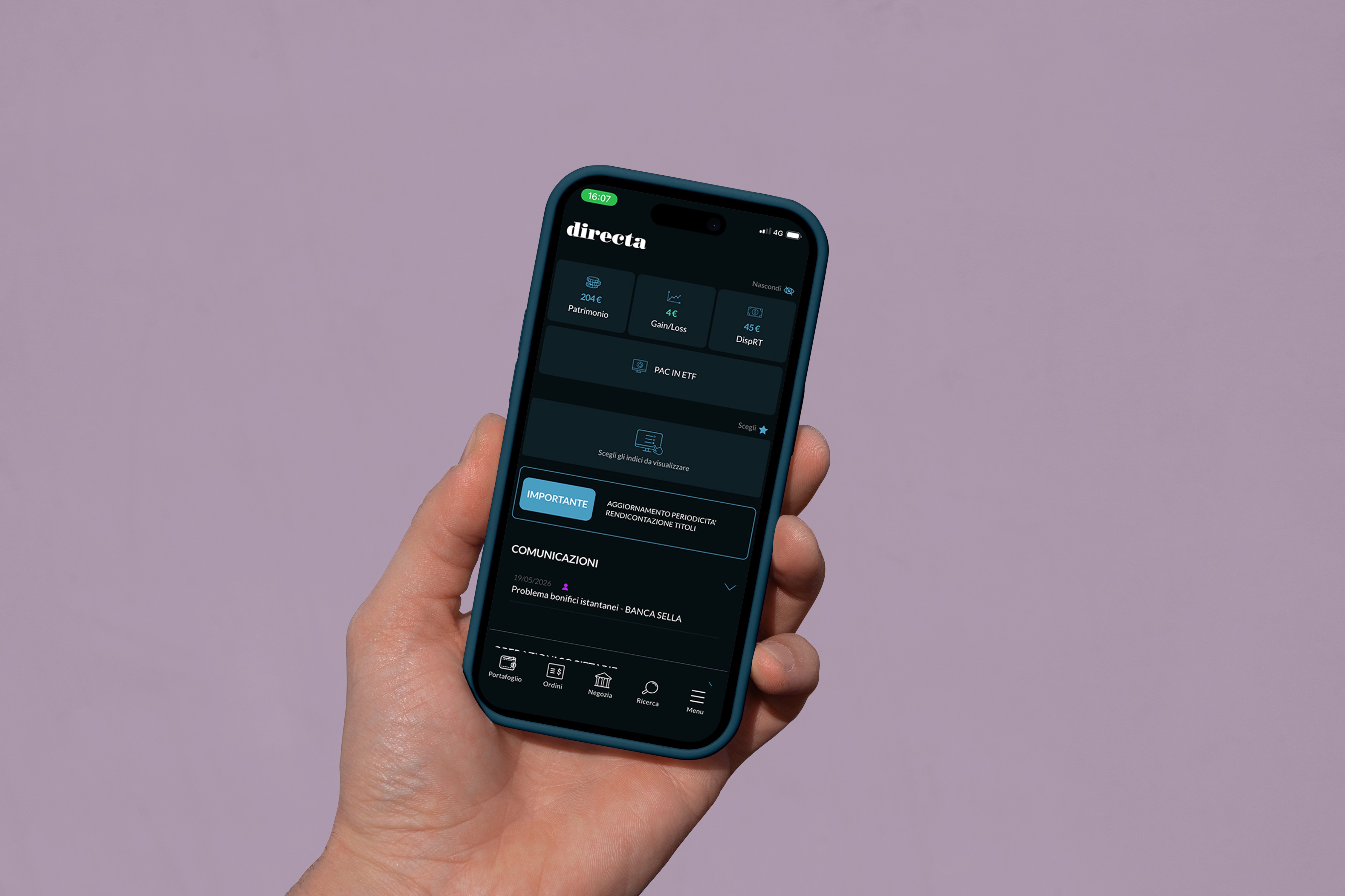
The platform currently features technical information that is not explained to the user, unnecessary screen sections that are never populated, and six main pages: being wallet, orders, trade, search and menu, main pages that function as toggle buttons.

How the platform looks like today

The platform currently features technical information that is not explained to the user, unnecessary screen sections that are never populated, and six main pages: being wallet, orders, trade, search and menu, main pages that function as toggle buttons.

Solutions

Investing is now a common ground for all types of users, from the most to the least experienced.
That's why we have simplified the app's overall structure, whilst retaining the technical informations that tech-savvy users will find useful, and adopting a modern, user-friendly interface.

Investing is now a common ground for all types of users, from the most to the least experienced.
That's why we have simplified the app's overall structure, whilst retaining the technical informations that tech-savvy users will find useful, and adopting a modern, user-friendly interface.

How I redesigned the platform

Starting with a complex information architecture and fragmented data, I designed a simpler, more intuitive approach to the platform, redesigning its visual appearance and the ways in which its different sections interact.

Let's deep dive

Let's deep dive

Into problems and solutions

Information architecture AS-IS

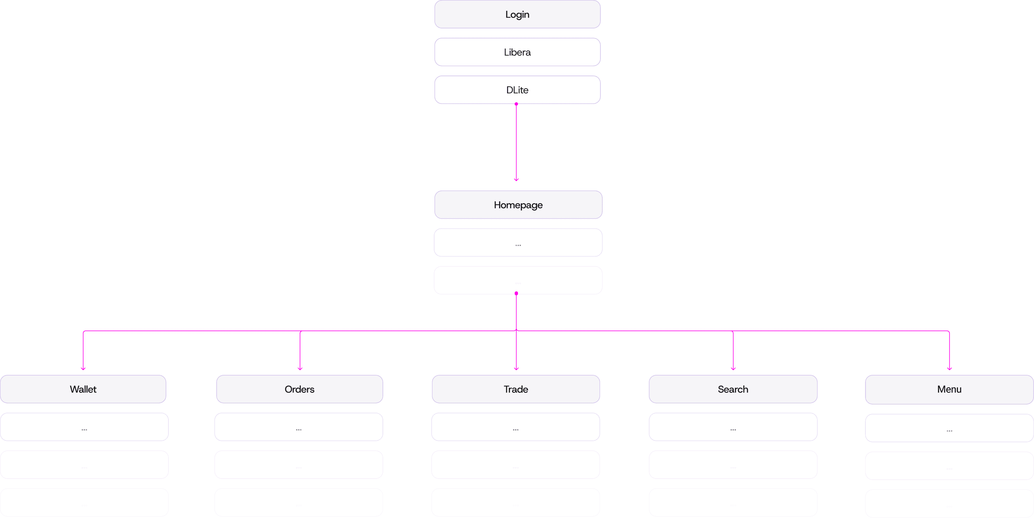
Right from the login page, Directa presents the user with a choice, offering the ‘Libera’ and ‘DLite’ options, without explaining the difference between them.


Once inside the app, the user will realise that there is no actual homepage, but rather six main pages that can be accessed via the tab bar, using what they will later discover are toggle buttons.
Information architecture TO-BE

The app’s navigation has been significantly simplified, offering users a single login option and three main pages: Homepage, Market and Account, thereby consolidating all the screens that previously served merely as duplicates.

The tab-bar

Along with the information architecture, the tab bar has also undergone some changes.

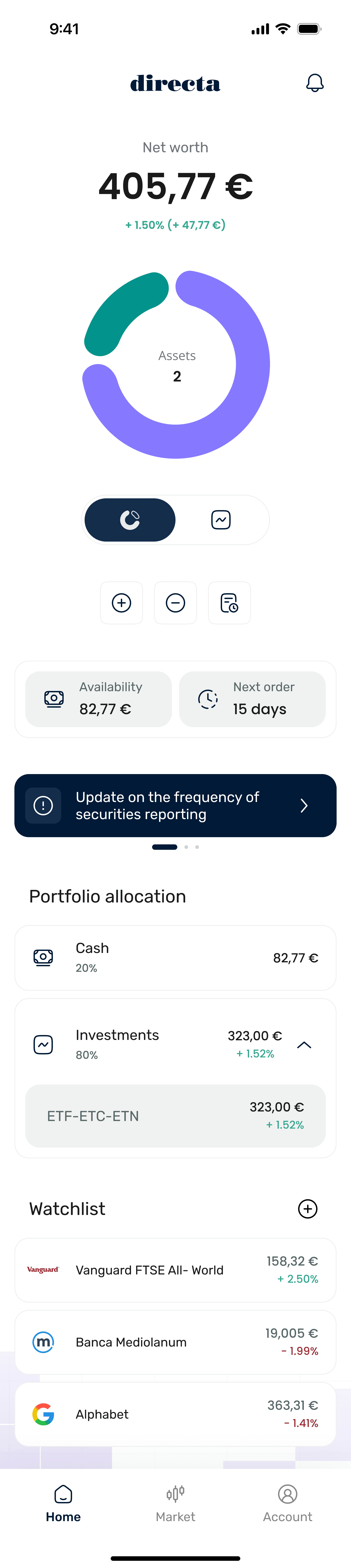
The Homepage now contains all the information on the user’s assets and portfolio, and the users can navigate trough secondary flows to view each detail page.

The Market tab combines the previous “Trade” and "Search" tabs, bringing together the current state of the stock market with the ability to buy and sell shares.

The Account tab contains all the user’s settings.

The new UI direction

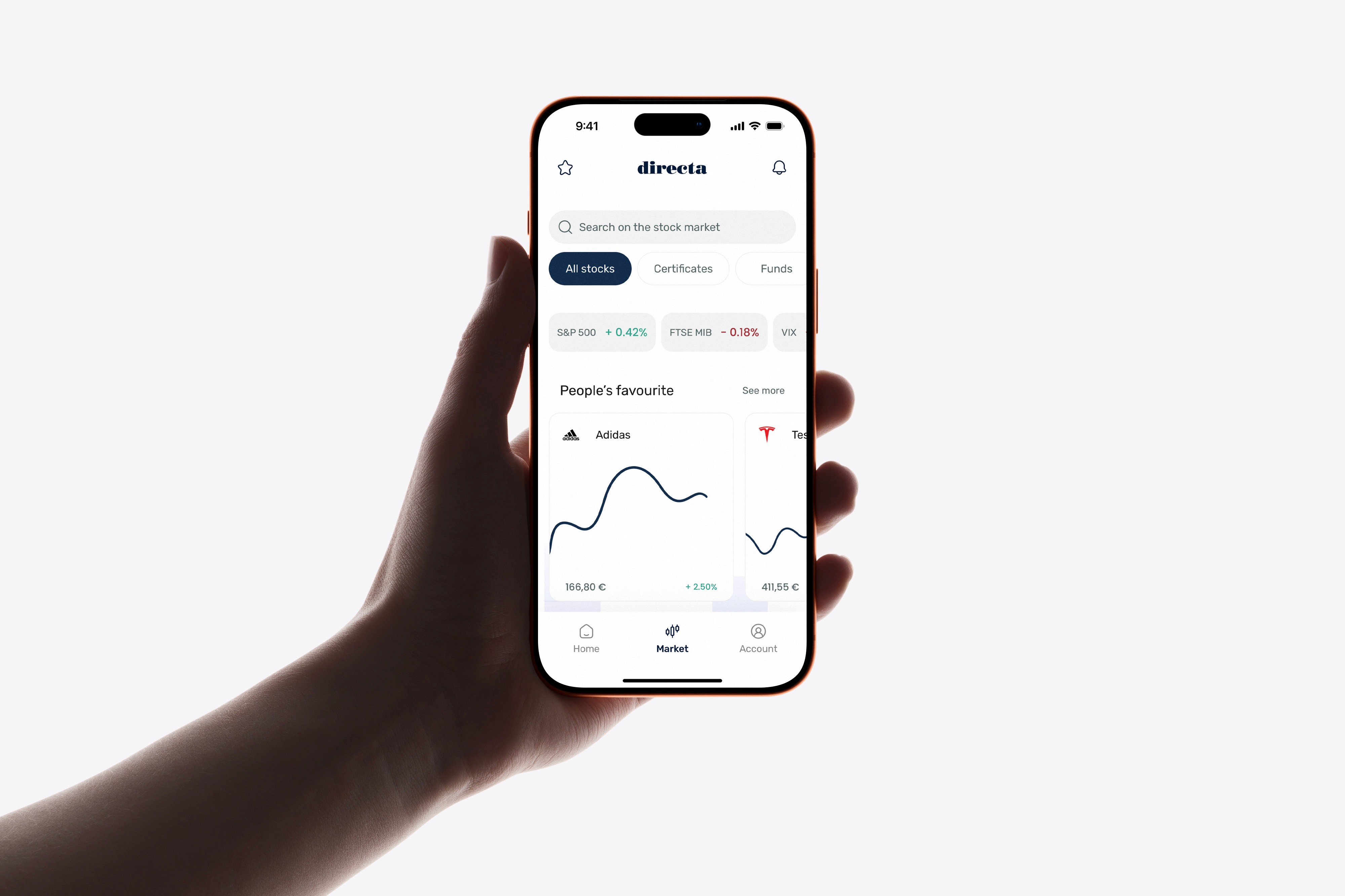
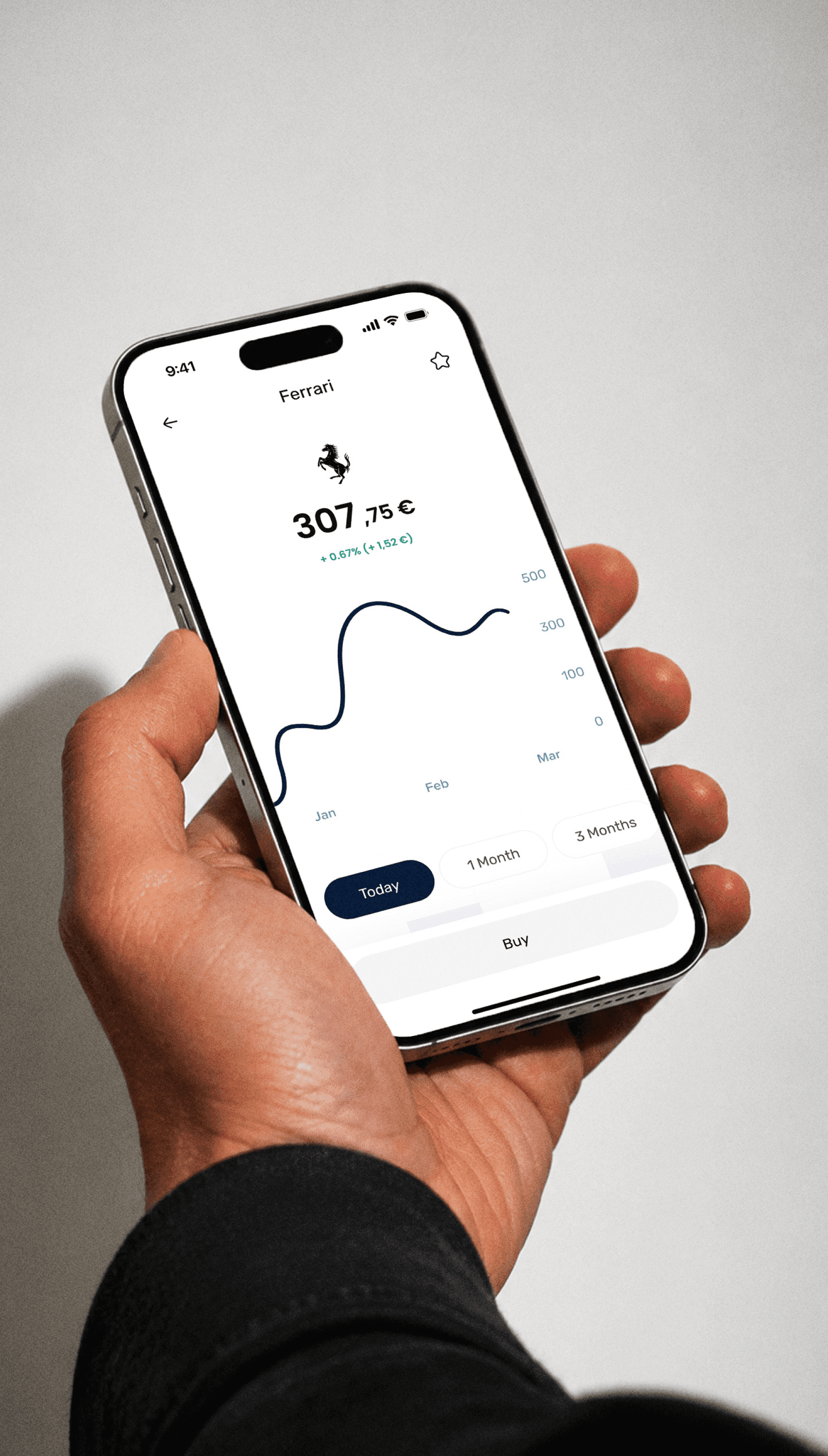
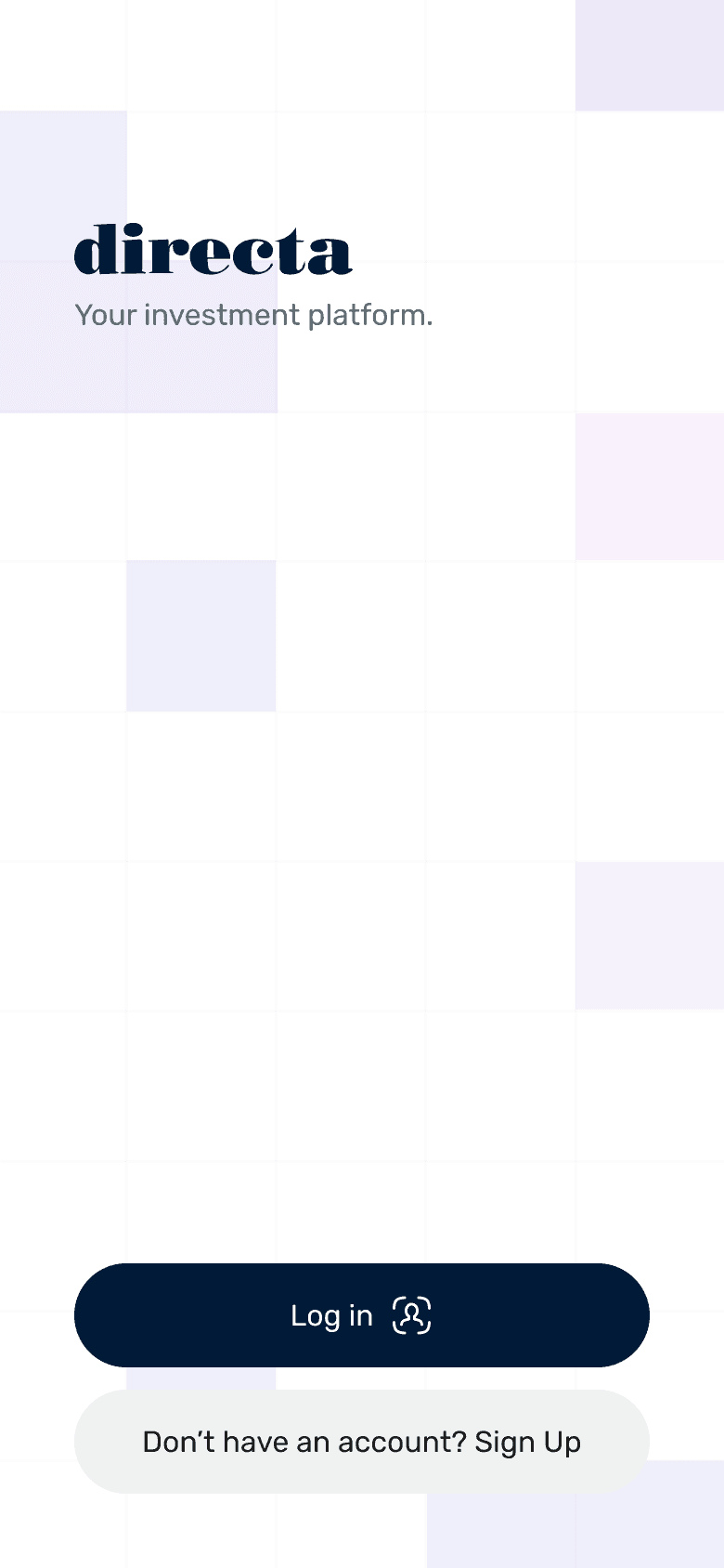
After designing the app’s structure and internal navigation, I set about updating its look and feel, giving it a cleaner, more modern appearance.

An animated geometric pattern appears, featuring on both the login screen and all the app’s internal pages, on the inside positioned at the bottom in a fixed layout.

Let's take a look at the full screens

Let's take a look at the full screens

Side by side

Homepage

Market

Asset page

How the platform looks like today

The platform currently features technical information that is not explained to the user, unnecessary screen sections that are never populated, and six main pages: being wallet, orders, trade, search and menu, main pages that function as toggle buttons.

Watch the other projects

B2B | Internal Banking Tool

Redesigned the Directa SIM experience, from an outdated brokerage service into a modern, data-driven platform.

Figma

FigJam

Designing with AI

4 ways I have incorporated AI tools to my day-to-day workflows.

Claude

Obsidian

Cursor

MCPs

Watch the other case studies

Watch the other case studies

B2B | Internal Banking Tool

B2B | Internal Banking Tool

Led workshops and meetings in order to redesign an internal banking tool that enables managers to fetch and retrieve informations about customer's contact history.

Figma

FigJam

Designing with AI

Designing with AI

4 ways I have incorporated AI tools to my day-to-day workflows.

Claude

Obsidian

Cursor

MCPs

Copyright © 2026 Bellocchio

Copyright © 2026 Bellocchio